“Are you inside or out?”

ZZ Top House
A topsy-turvy design deliberately confounds perspective by bringing in the outdoors. Natural light pours into the sky-high living spaces through zigzagging louvres and skylights to create a captivating inside world where the home’s beautiful details are the view.
“The first time I walked into our finished home, I couldn't wipe the smile off my face.
It was a massive thrill.”
- Liz, Owner
Photography by Murray Fredericks, Michael Lassman
Restoration rather than replacement of original heritage features, such as the front balcony, balustrade, locks, cornices, gutters, downpipes, boundary walls, windows and doors
The design optimises cross ventilation, thermal mass, insulation and passive solar strategies to achieve a comfortable environment
Near carbon neutral off-grid electricity via a 10kWhr solar panel system and Tesla battery storage
Recycled dry-pressed bricks plus minimal demolition of existing structure to reduce the home’s embodied energy
Re-use of old sandstone footing in retaining wall and landscaping
Original floorboards repaired using existing timber from the ensuite bathroom
About this home
The brief
Now their kids are grown, Mat and Liz wanted to downsize closer to the city. Having found the perfect property to develop, they approached CplusC to create a home that fits them in every way. Their vision was for ample space for family members to entertain, play mahjong and enjoy quiet time together and apart. Avid scuba divers, they needed an area to store and clean their gear. Liz is a geologist, and the couple appreciates natural and exposed materials, such as timber and raw concrete. Both were excited to display memorabilia that told the story of their family. Initially, they didn’t plan to alter the existing three upstairs bedrooms and bathroom, which they reserved for their one child still at home and two independent children should they want to return. Once things got underway, the couple decided to renovate these spaces too.
The site
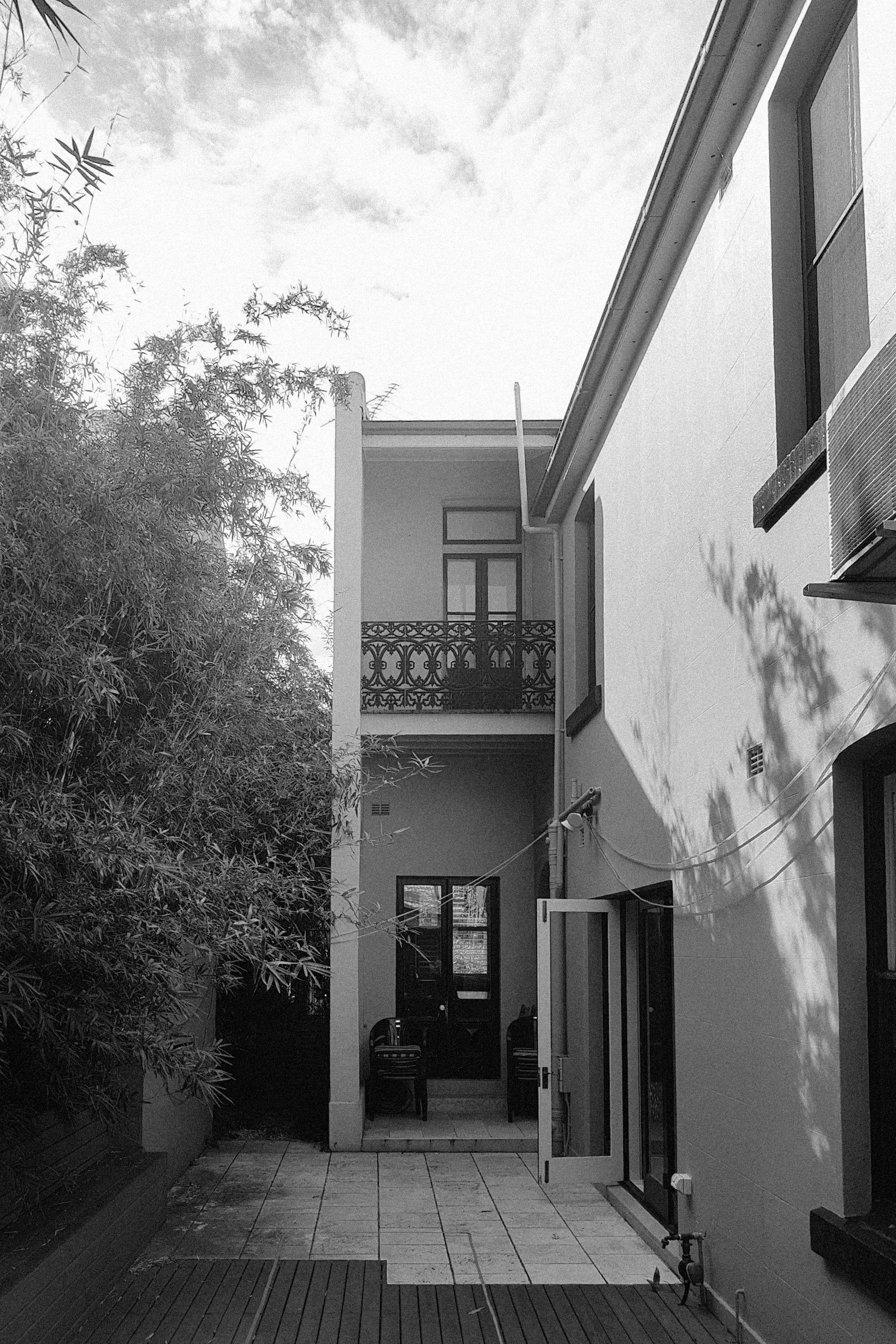
The project scope was alterations and additions to a grand dual-frontage Victorian terrace house built in 1884 in McMahon’s Point. On an unusually long block with front and rear access, the site is in a light industrial zone with a warehouse on either side, one of them a sound recording studio. Upstairs were three bedrooms and a bathroom. At the rear was a semi-detached studio apartment over a double garage providing parking for four cars. Notably, the site offers little outlook or views.
The design
Responding to the unusually long and inward-looking site, the CplusC team wanted to create approachable spaces that delight the eye all on their own, without needing views to the outside. Principal architect Clinton Cole and project architect Carmen Chan created a design concept inspired by two ideas: the zigzag and the geode.
Clinton explains: “The site is extraordinarily deep and our concept for it was expansive, with a dramatic cathedral ceiling 5.2 to 5.8 metres high. To stop it from feeling too vast and drawn out, we looked for ways to compress the space. We settled on an accordion concept to distract the eye and connect all the living spaces while keeping them distinct. It’s expressed as a zigzag motif which you see in the angled louvres, the brickwork, the brass floor detail and the custom kitchen bench.”
Their design for the four-bedroom, 2.5-bathroom home retained the entire original terrace house at the rear ground level and turned most of the ground floor into a massive living area flowing from inside to out. The entrance was moved to the side, giving instant access to the living spaces. At entry level are the kitchen and dining rooms, with lofty louvres, skylights and vertical lighting cavities emphasising the big airy spaces. One level down, the living area transitions to the undercover outside living space and garden. Everywhere, windows and open spaces bring the outdoors in, creating abundant visual interest inside the inward-looking house.
“We took inspiration from geodes, which are plain old rocks that if you crack them open contain extravagant inside worlds of light and shape and colour,” Clinton says. “The detailing in ZZ Top House creates the outlook: the zigzag motif, the outside-inside feeling, the louvred windows and the interplay of light and shade. They all work together to make an ever-changing spectacle inside the home.”
When Liz and Mat saw the design they were all in. Liz said: “Clinton and the team listened and incorporated the things we wanted with a unique, spectacular interpretation. They gave us something we could never have dreamt up ourselves.”
Mat agrees. “The design blew us away. CplusC melded old and new to create something very unique. In just one example, their idea of changing the traditional entry point from the front to the side really shifts the experience of the space. We hadn’t remotely considered this but absolutely love the impact it has.”
“The design blew us away.”
- Mat, Owner
The build
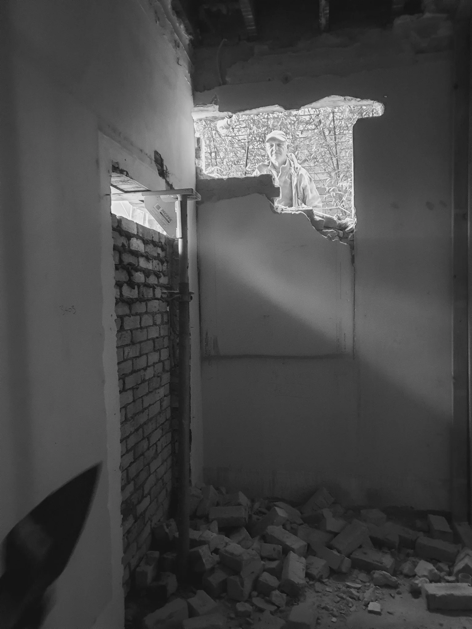
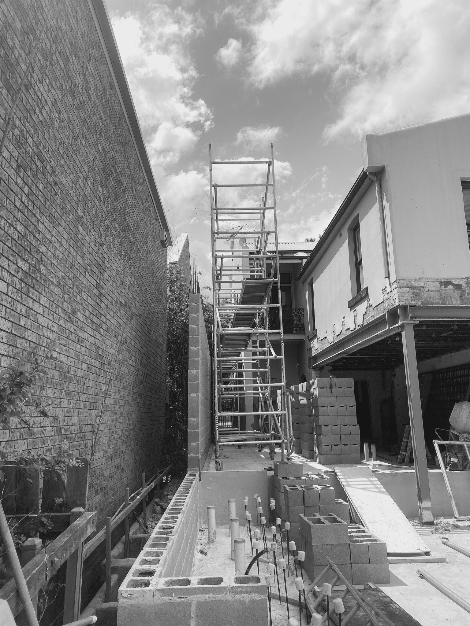
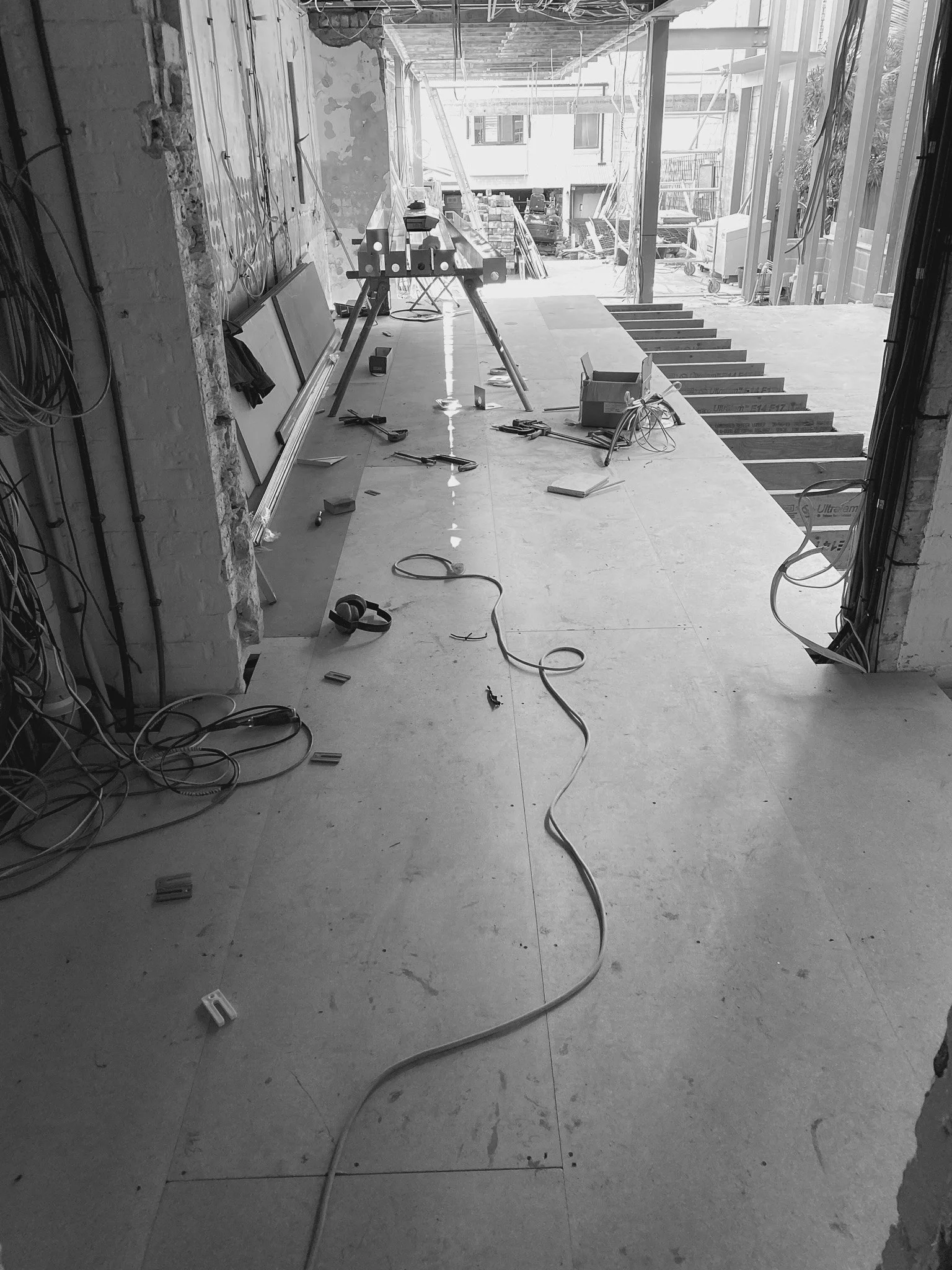
To minimise site noise for the sound recording studio next door, the CplusC construction team stockpiled building supplies against the wall to create a sound buffer and set to work demolishing the existing kitchen and structural walls. Then we suspended the new kitchen and dining room on new structural supports.
With a vanishingly small footprint, the under-stair guest toilet was tricky to build. Using the smallest possible tiles and installing the extraction vent in the floor, we proved nothing is impossible.
For Mat and Liz, seeing their home take shape was an incredible experience. “Dropping by to see build progress was always a high. We’d restrain ourselves from visiting too often so the next visit would be equally revelatory,” Mat says.
Despite difficult site access, we were ahead of schedule. With a clearway out front, parking was tough, and flatbed delivery trucks could not negotiate a tight corner to reach the site at the rear. Construction equipment and materials were loaded from a truck onto a trolley and manoeuvred painstakingly down a pathway 900 millimetres wide. A 6.8-metre length of structural steel for the kitchen beam had to be cut up and rolled in piece by piece.
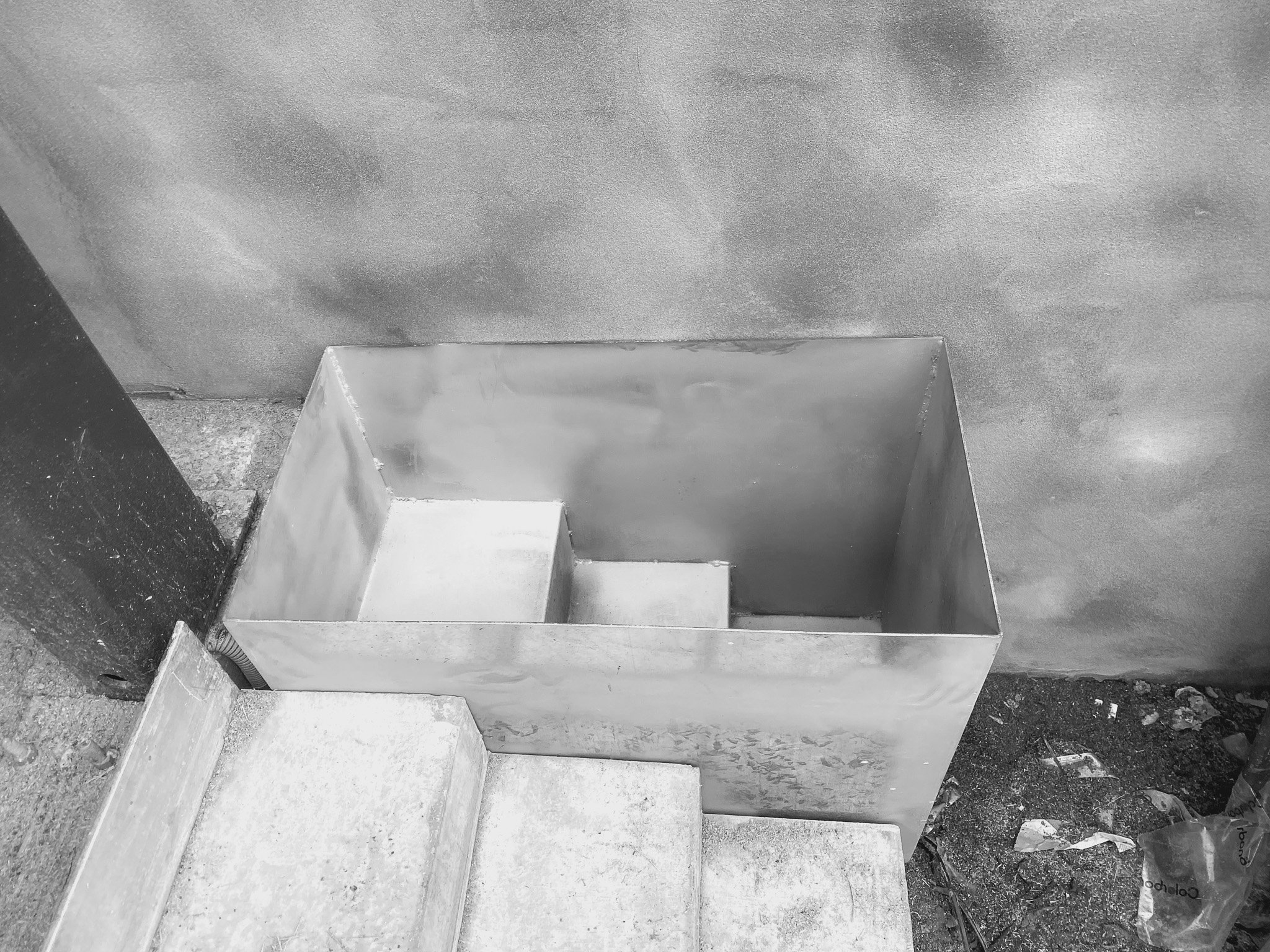
Midway through construction came a quirky surprise – a vaulted well part on the property and part on a neighbour’s. We created a structural bridge for it using an upturned beam and kept right on working.
“The communication was great,” says Liz. “Everyone worked so fast that the timelines reduced regularly. And the quality of the work and the finishes exceeded our expectations.”
“The CplusC construction team did a fantastic job and could not have been more welcoming.”
- Liz, Owner











The result
A living geode
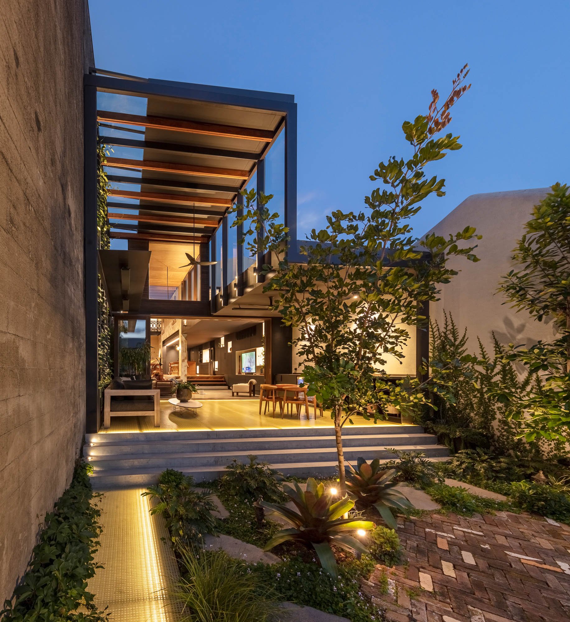
With no outlook to work with, CplusC’s design for ZZ Top House is inspired by geodes, rocks that contain hollow cavities lined with crystals to create dazzling inner worlds. In the same way, the home opens from an unassuming exterior to reveal a fascinating space inside. Bold 3.8-metre-high louvres and skylights admit light to this secret world, creating a beautiful symphony of light and shade nuanced by season and time of day. An accordion design compresses and connects the vast spaces, wittily expressed by a recurring zigzag motif explored in the floors, the louvred windows and even the kitchen bench.
Liz says: “The first time I walked into our finished home, I couldn't wipe the smile off my face. It was a massive thrill. Now, seeing the soaring space and the way it all works so beautifully is an amazing combo of ‘coming home’ and ‘wow’!”
The wow starts at the door
One of CplusC’s transformative ideas was moving the front façade entrance to the side, reducing the perceived length of the home and using the normally wasted space of the side entry path more effectively. “The house opens around you the instant you enter. There’s no trekking down a corridor past bedrooms to get to the living spaces,” Clinton says. “This creates an arresting experience for everyone who walks in.”
Liz says: “I love when someone we know walks through the front door for the first time, watching the look on their face as they take it all in. I know what they’re seeing as I see it every day: the way the light and shadows play on the surfaces, such as our big brick dining wall and the floor, and vary with the day, the weather and the season. The way all the spaces work individually and as part of a whole.”
Turning the house inside out
The house deliberately confounds perspective. It feels like you’re outside.
“We called it ZZ Top House because of the zigzag motif – also because it felt fun and irreverent and a little bit rock and roll to turn the house on its head and create this outside-inside feeling that makes you question where you are,” Clinton says.
Mat enjoys watching guests grappling with what they see. “Their eyes widen, their mouths open and they gaze up, trying to figure out if they're inside or outside – they're inside, of course.”
The design dissolves the feeling of being inside in several ways. External elements are used inside, and the outdoors is featured everywhere through ample use of glass. These outdoor reference points conspire with the extraordinary volume of the living spaces to create a light and open feeling. For Mat and Liz, who love the great outdoors, it’s like living outside.
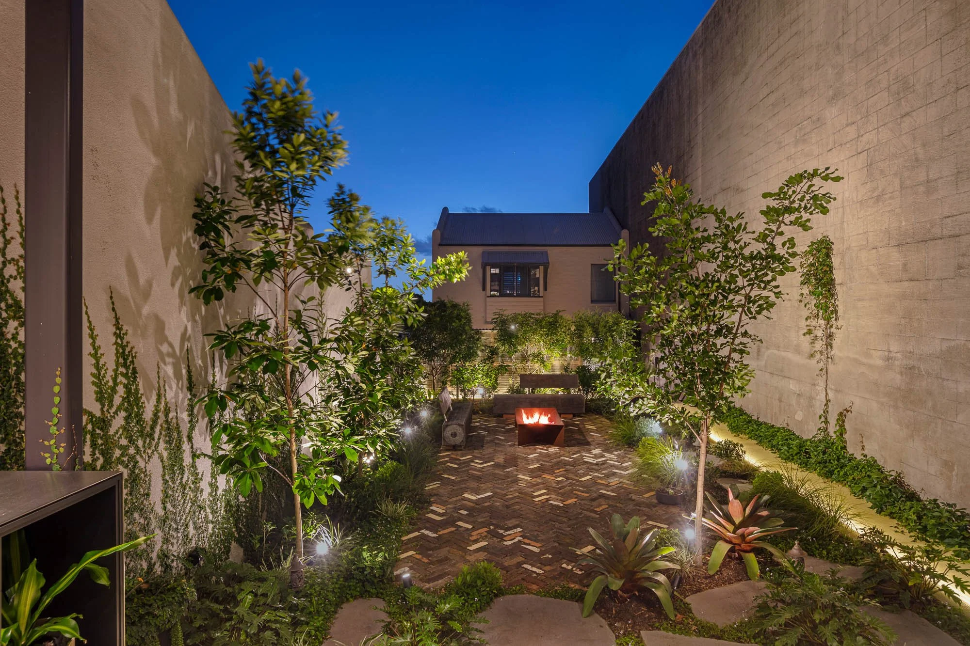
Clinton explains: “A big part of the architectural concept was to make external elements visible internally, like the original arches, rear terrace house balcony and the exterior walls of the surrounding warehouses. We deliberately blurred the line between outside and inside to give the home a topsy-turvy edge.”
Living areas
The kitchen, dining and living areas were worked into an open, warm and interconnected space that reflects the spontaneous and gregarious life of the family. It’s the perfect setting for frequent gatherings, with an open galley style kitchen with generous bench widths and an island bench to gather and chat, plus a compact guest toilet ingeniously built under the stairs. Throughout, custom joinery showcases the family’s prized memorabilia, including oars, degrees and family relics from WWII. Beautiful natural light illuminates all the rooms from the louvres and skylights.
Mat says: “The results are beyond anything we expected. It's a really easy place to live in. I enjoy the openness, the space and how the indoor kitchen, living and dining flow to the outdoor living, dining and garden. We love having the house open to the outdoors. And the lighting, inside and out, makes the house sparkle at night.”
Kitchen
Almost 3 metres above the kitchen and supported by a massive steel beam, the original rendered rear terrace wall forms a striking setting for family life. Scooped out of it is a sleek and streamlined kitchen with a custom wine fridge, cleverly concealed appliances, a Zip tap, tailored storage for vinegar and oils and a custom-cut zigzag marble and timber bench.
Outdoor living
A generous covered living space extends the social spaces of the home into the outdoors, with a barbecue area, comfortable seating and a 2.6-metre-long dining table ready for spontaneous gatherings. Beyond that lies a low-maintenance garden with a firepit and custom benches – the perfect place to enjoy an illuminated mural projected onto the massive warehouse wall by night.
A home rich in detail, texture and craft
Our team took pains to refine every detail. When we couldn’t source the right wine rack for the couple’s wine collection, we created one for them. We also built a custom mailbox with a keycode and a concealed flyscreen door. Along the way we solved many technical challenges. For example, the upper louvres in the living area are operated by an automatic system while the lower louvres are manual. Our team integrated the two control systems and even created custom handles. Cabling, piping, ducting and services were skillfully concealed by our master builders.
“I love the zigzag detail and how it carries through the louvred windows, the kitchen bench and the brick floor,” says Mat. “The internal up/down lights on the western brick wall look amazing. And the custom mailbox and flyscreen door make me smile every time.”
Wet area
Both Mat and Liz scuba dive and a new wet area enables them to store their gear onsite, including wetsuits, BCDs, flippers, masks and tanks. It’s near the parking spot so it’s easy to clean, dry and put away gear after a dive.
Bedrooms
The ground floor master bedroom has a relaxed private atmosphere with excellent natural light, cross-ventilation and room for a king-sized bed, plus an ensuite bathroom and generous walk-in wardrobe. The upstairs bedrooms and bathroom were renovated, creating a comfortable zone for the couple’s children when home.
Laundry
The house includes a dedicated laundry with washing machine and dryer, laundry sink, and storage for cleaning and household tools. There’s plenty of space for clothes sorting and ironing plus an undercover external clothes drying area.
Fully automated
The home is fully automated. Everyone in the family can control lights, locks, ceiling fans, air-conditioning, music, underfloor heating solar and the CC-TV surveillance system with a few taps on a smartphone.
Sustainable
CplusC is renowned for taking an integrated sustainability perspective, and ZZ Top House is no different. It features a 10kWhr solar system supported by Tesla battery storage, enabling near zero electricity bills throughout the year. The design creates a comfortable environment to minimise the need for heating and cooling by optimising cross ventilation, thermal mass, insulation and passive solar strategies.
We reduced the project’s embodied energy by using recycled floorboards and dry-pressed bricks and restoring rather than replacing the original heritage features, such as the front balcony, balustrade, locks, cornices, gutters, downpipes, boundary walls, windows and doors. This principle of re-use helps the additions and alterations harmonise with the original building and creates an endlessly interesting interior – for example, the feature wall above the dining table is the outside wall of the original house, and a preserved back terrace balcony now looks into the indoor dining space, once the side courtyard.
To minimise the need for further renovations down the line, the home is future-proofed for later life stages, so the bathroom features handrails and discreet custom-made grabrails plus higher toilet seats.
A forever home
Mat and Liz couldn’t be happier with the result.
“We feel great knowing there weren't any ‘mistakes’ because we chose the right architectural firm and did our homework along the way,” says Liz. “All the hard work of deciding how we want to live and finding someone to make it happen paid off. We’ll enjoy the result for many years to come.”
“All the hard work of deciding how we want to live and finding someone to make it happen paid off.”
- Liz, Owner


Project Team
CplusC Team
Hayden Co’burn - Architectural Project Manager
Nathan Krstevski – Carpenter
Clinton Cole – Architect + Builder
Consultants and subcontractors
Structural Engineer – Partridge
Plumbing – JH Gordon
Electrical – D2E
Doors & Windows – Windoor
Joinery – SKC
Painting – Orange Painting
Bricks – Brazil Construction
Glazing – Balmain Glass
Structural Steel – Tenze
Roofing – Flash Metal Roofing
Setting & Plaster Works – Mick Williams Plastering
Landscaping – Bell Landscapes


